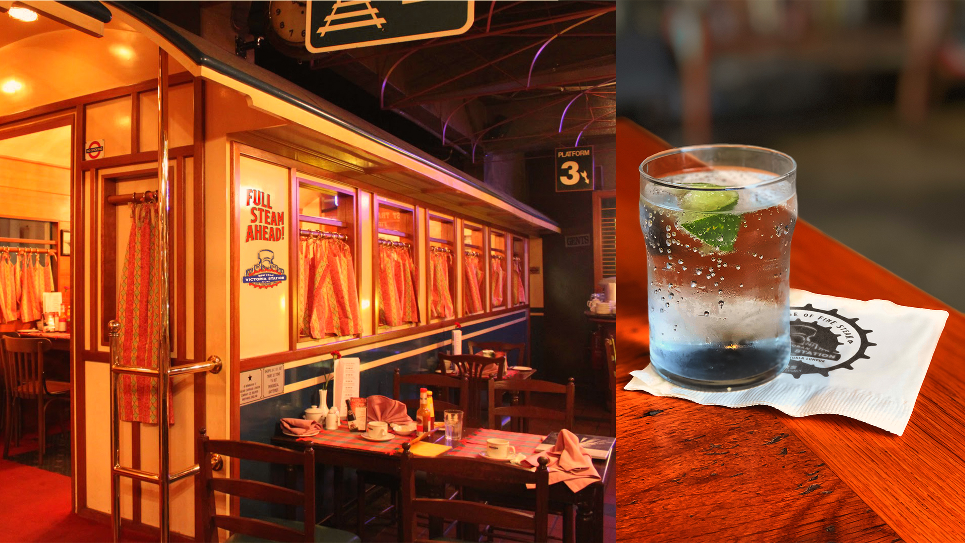
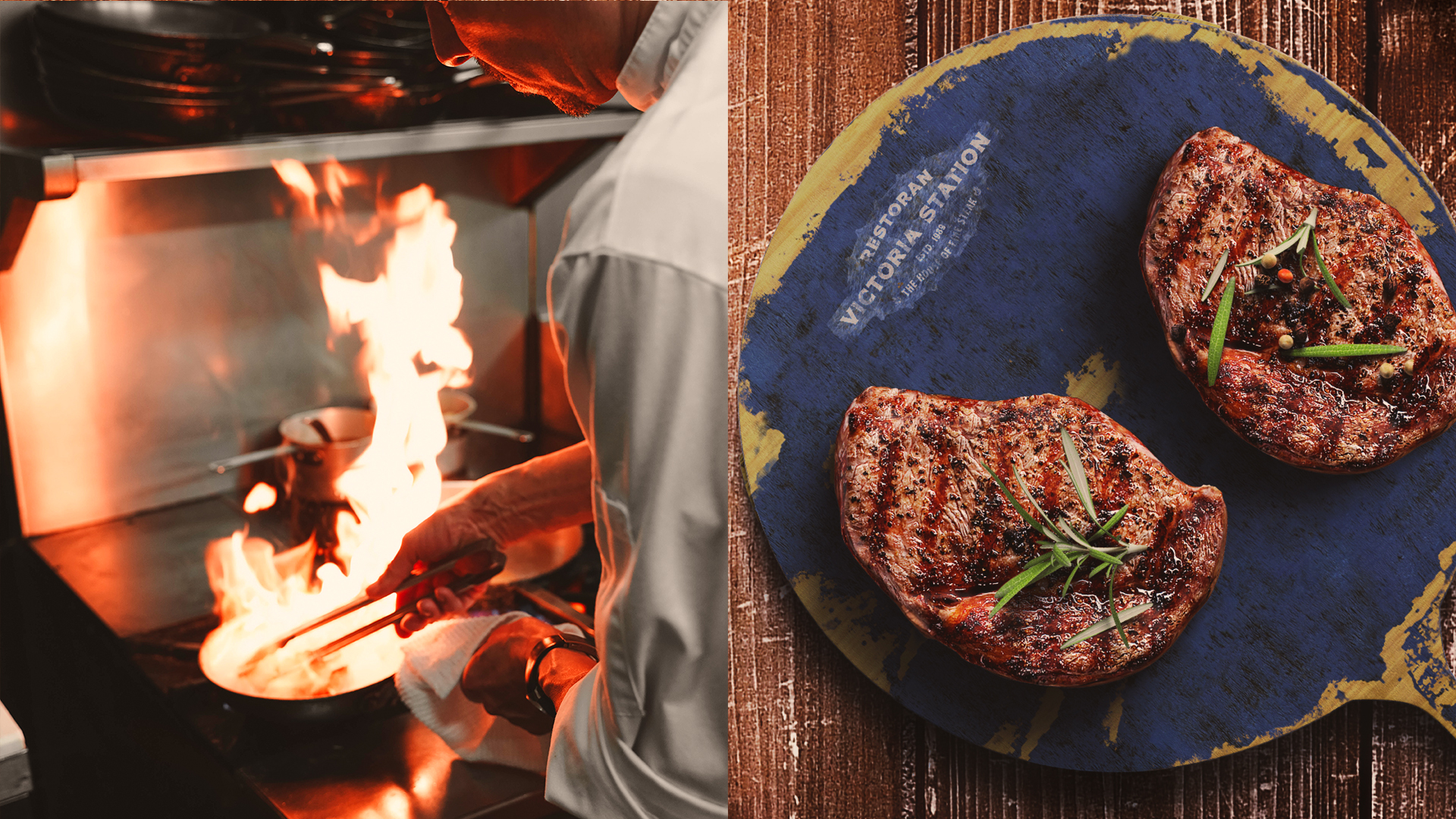
Whenever you travelled the streets of Jalan Ampang, you’d be surprised to see an actual train parked there. That’s right, a life-size steam locomotive coming out of a restaurants called Victoria Station. This 33 year old eatery serves delicious, the best-in-town steak and grill you could ever eat.
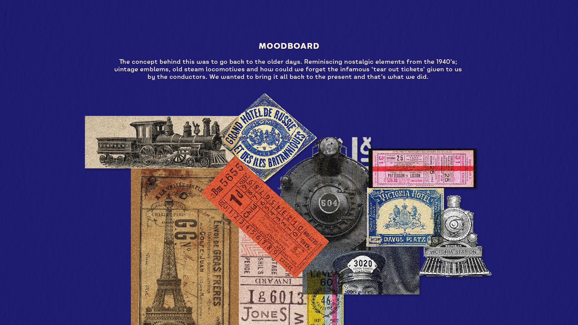
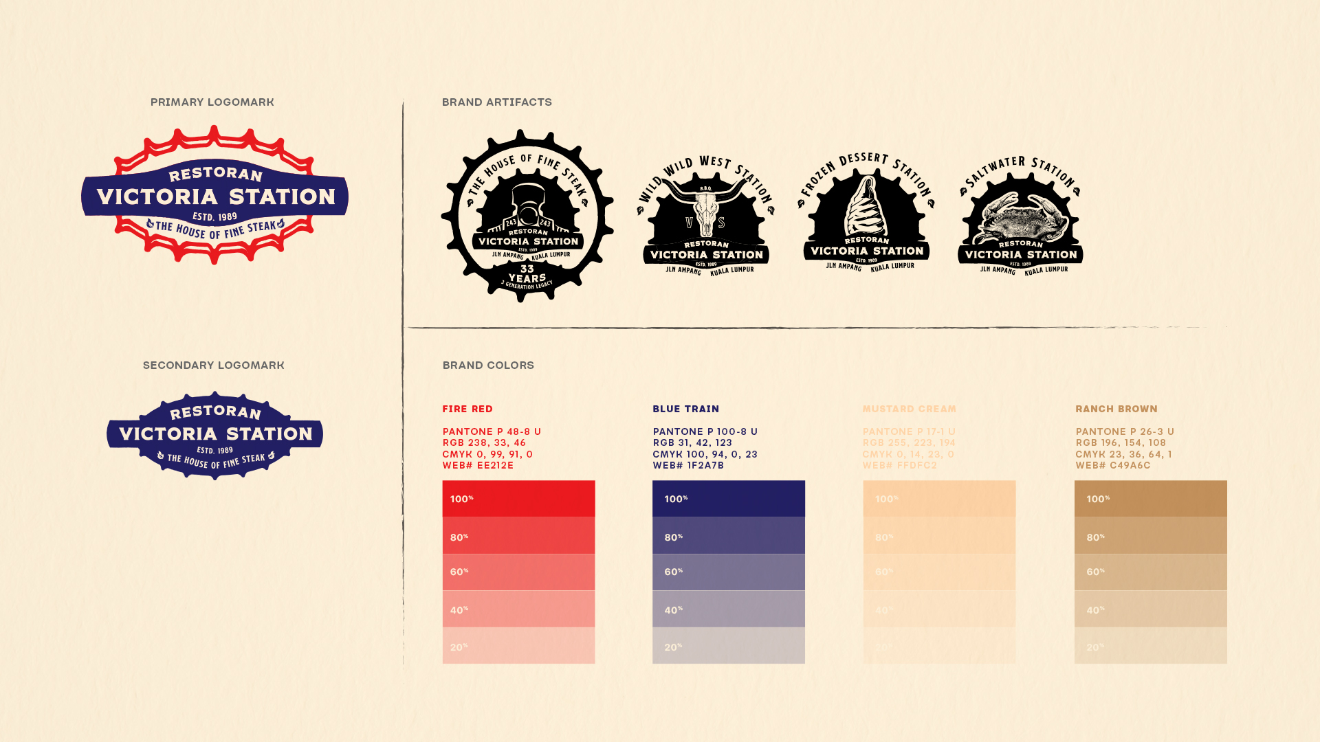
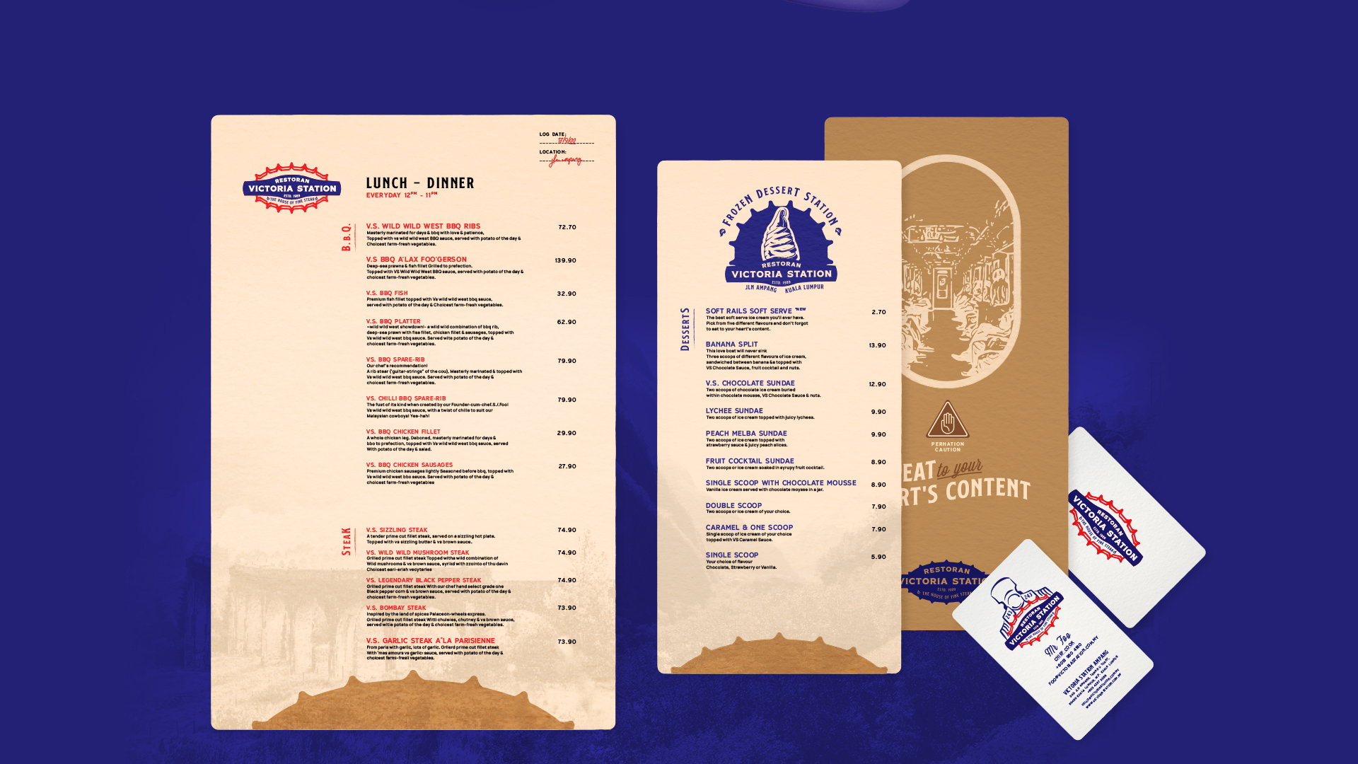
The objective was to ensure Victoria Station Restaurant’s rebrand kept its iconic emblem and colours. With that in mind, the logo is polished with nostalgic elements from the 1940’s bringing a much captivating design without compromising its original shape. It gave a fresh look to their menu booklet, signages as well as other collaterals like packaging.
Food packaging is such a vital piece when it comes to eateries. With help of the vintage elements in the moodboard, the design process for their soft serve cups packaging was a journey. The packaging is crafted around old tear-off train tickets with a twist fruity zing.