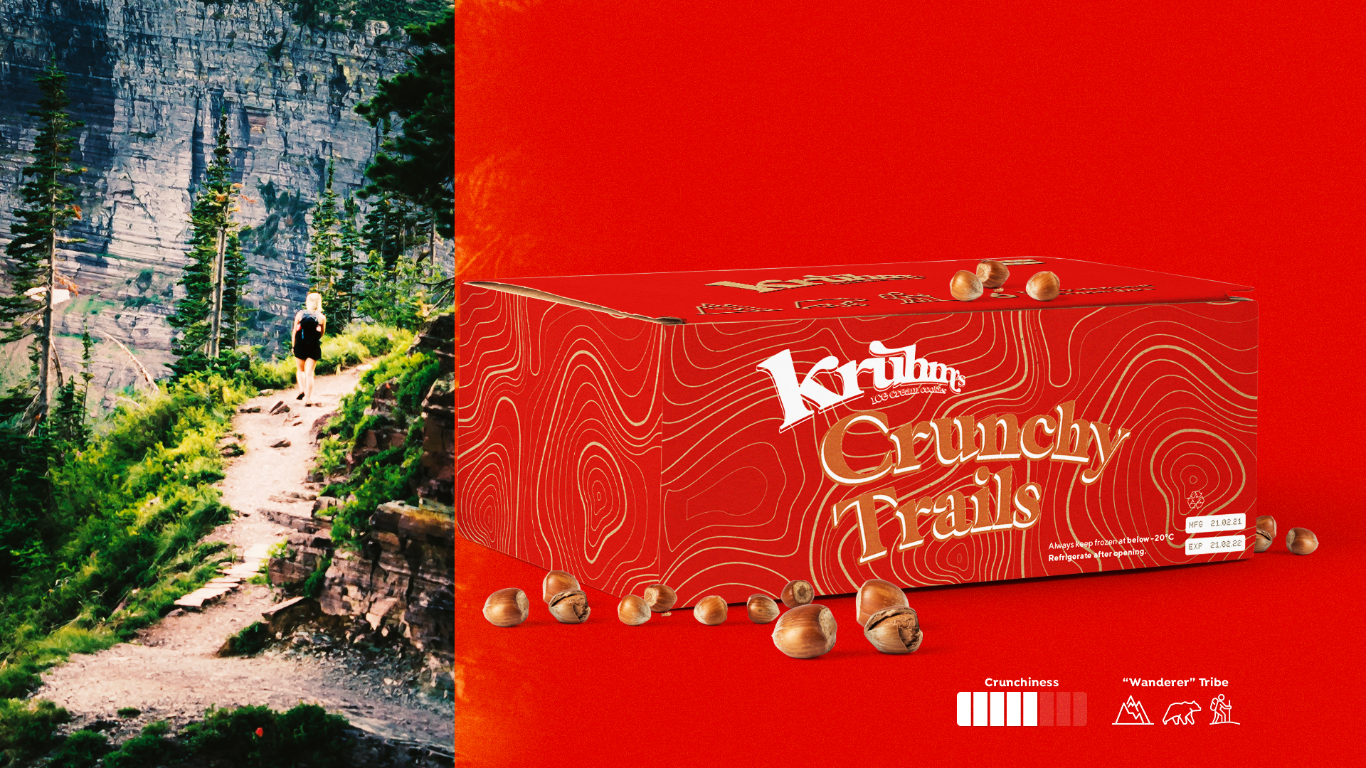
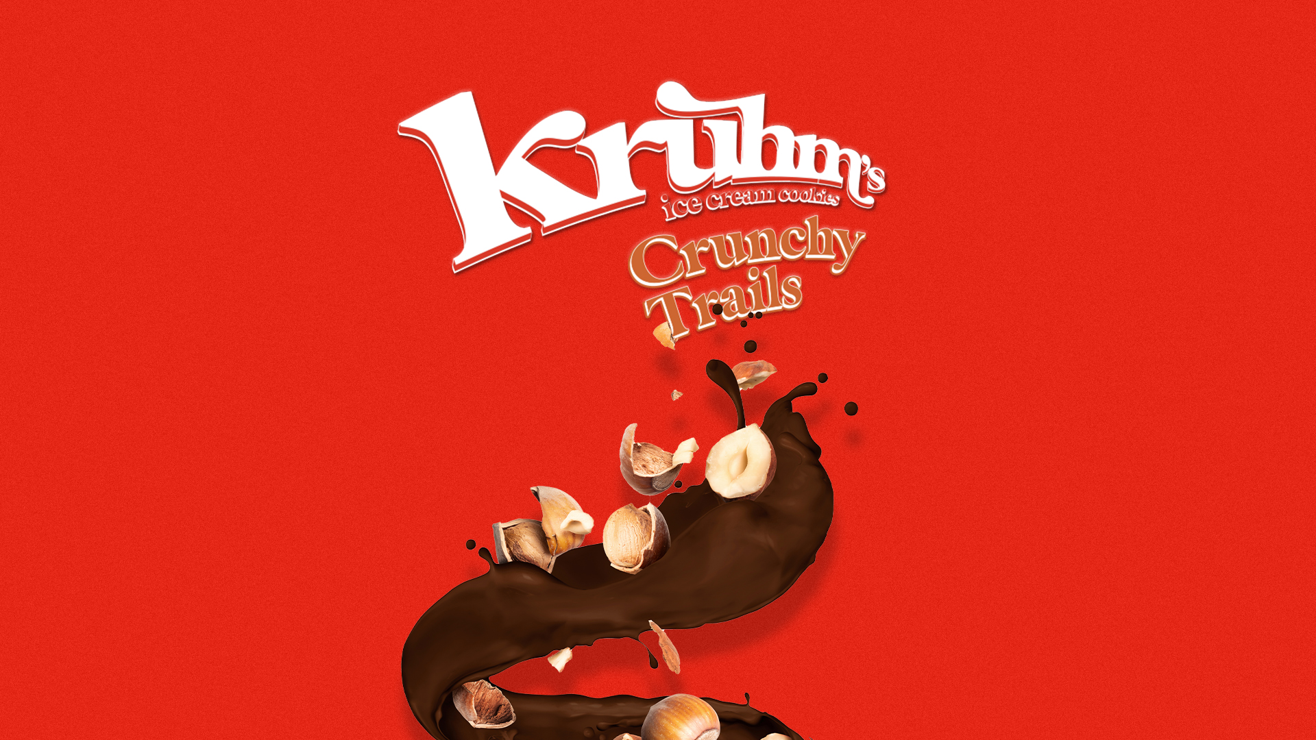
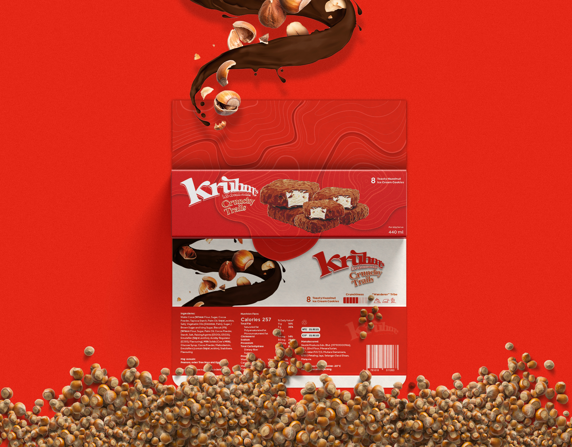
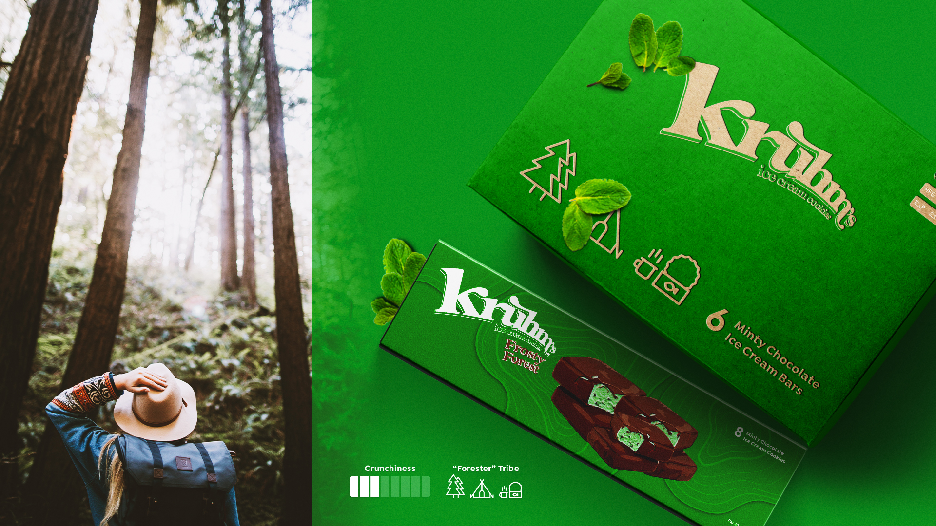
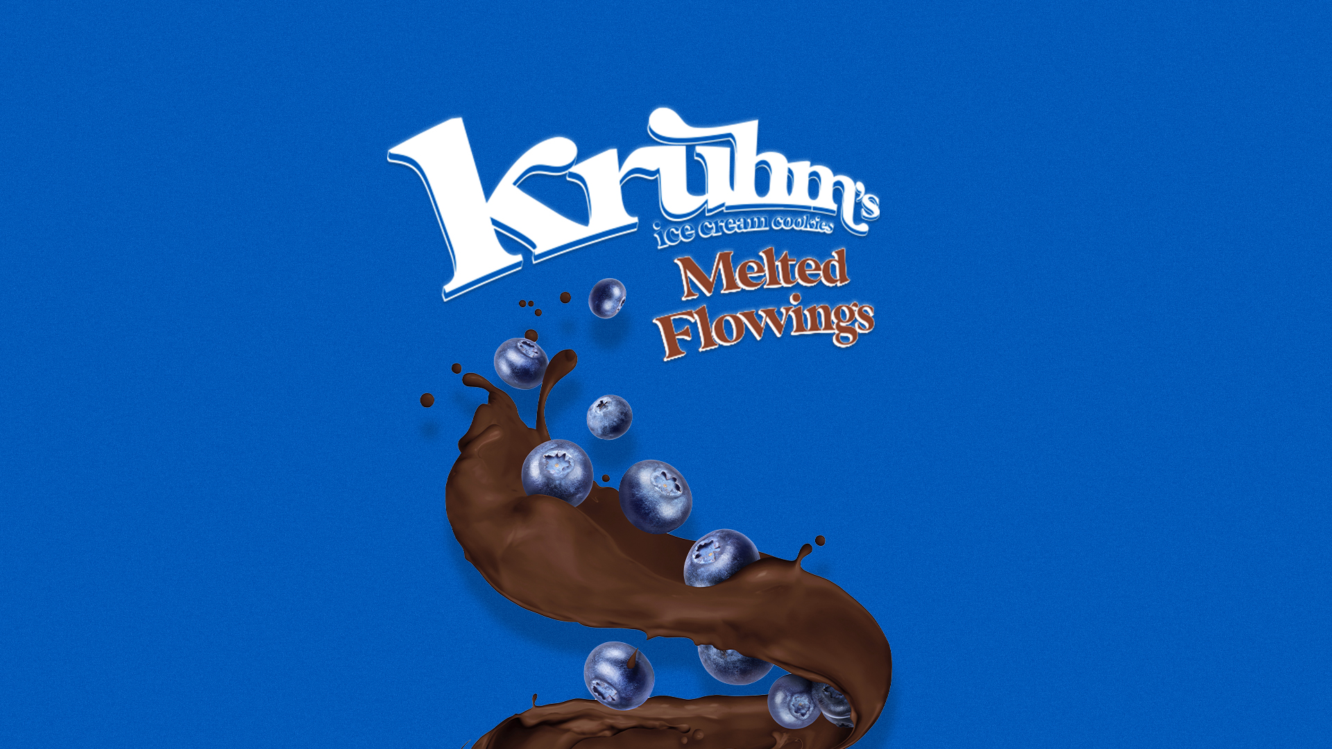
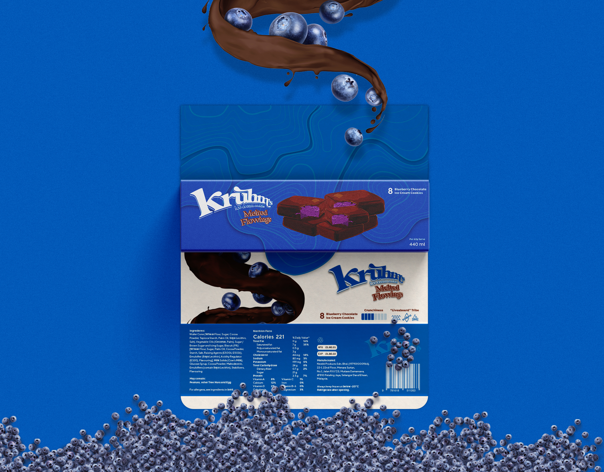
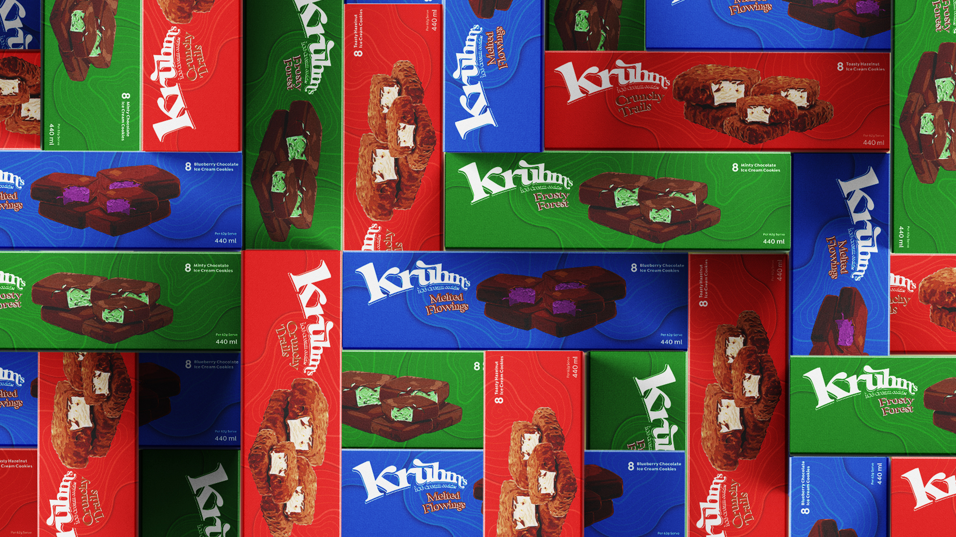
This concept piece simply pays homage to the original Klondike Bar. I conducted extensive research, including market trend analysis to uncover the brand’s unique name. From my findings I settled on a core concept: “cccrruummpp”, that delicious crunching and chewing when we bite into a cookie. That was what my job was. To capture the experience of eating Kruhm with colour, lines, shapes, textures, photography. Then melding it all into a brand design that becomes irresistible to their customers! I used an eye-catching colour palette inspired by natural ingredients – the crimson of hazelnuts, the blue of berries, the green of mint.
BRANDING
Logo Design
Packaging Design
Lifestyle Photography


