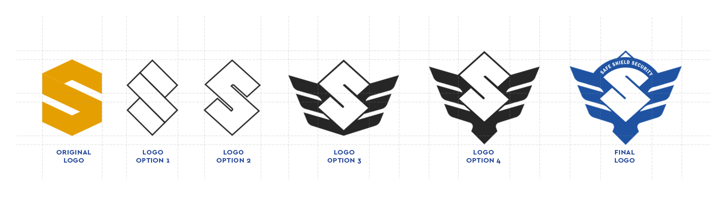
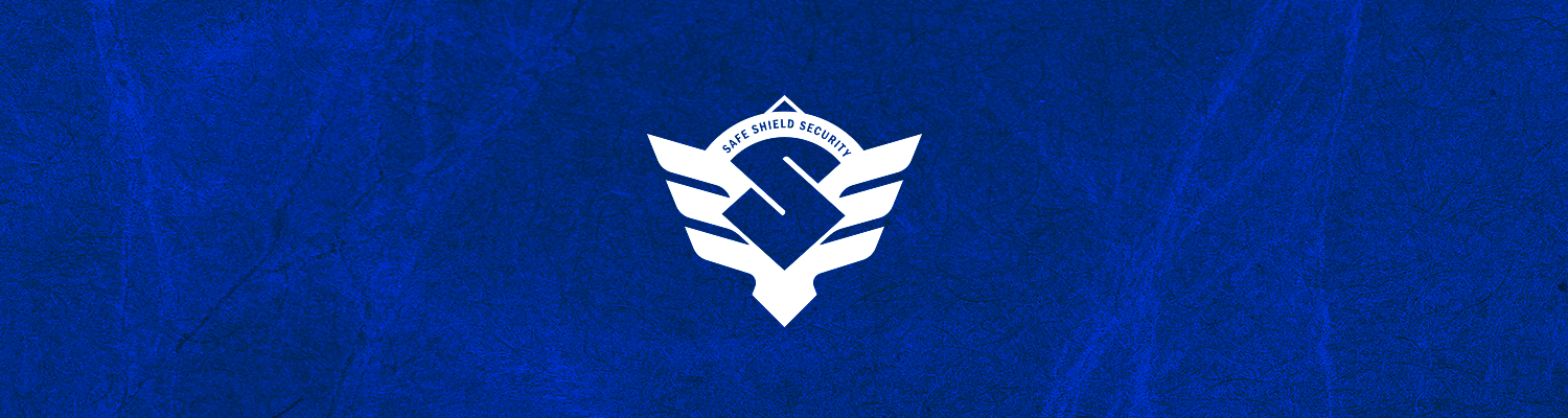
A security firm client required a new look logo to improve on its original logo design based on the letter “S.” We strengthened the original by adding chevron wings and a striking tail giving it the power badge look of a super hero – just the kind of brand identity a security company needs and to be perceived as. Strong. Powerful. Safe. Secure. Visit Safe Shield Security Malaysia.
BRANDING
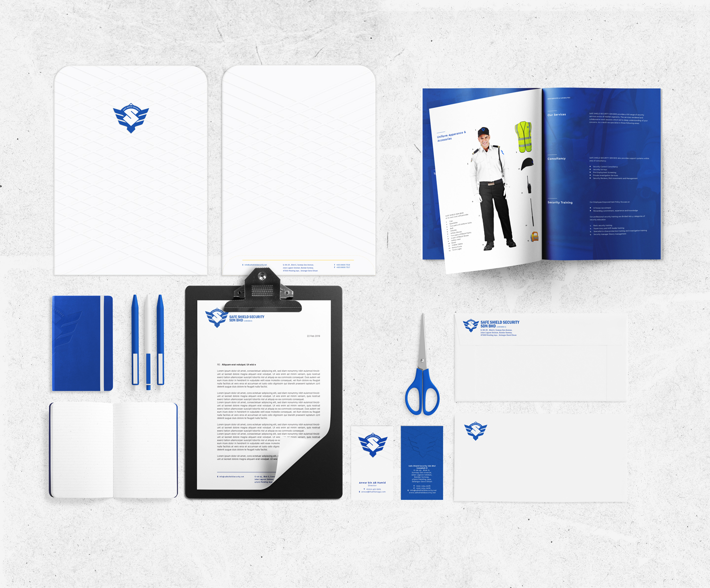
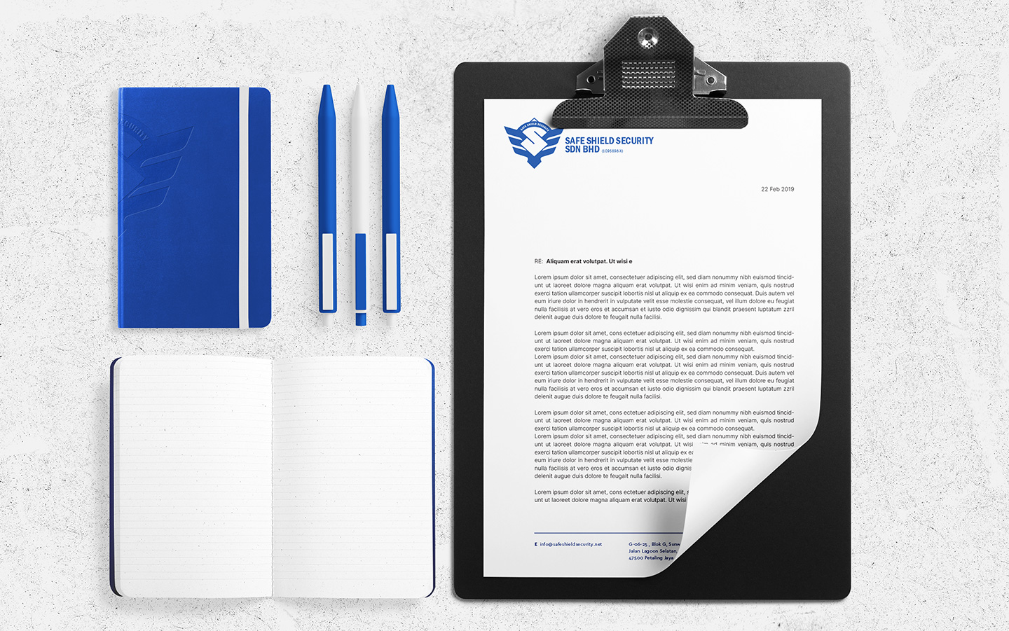
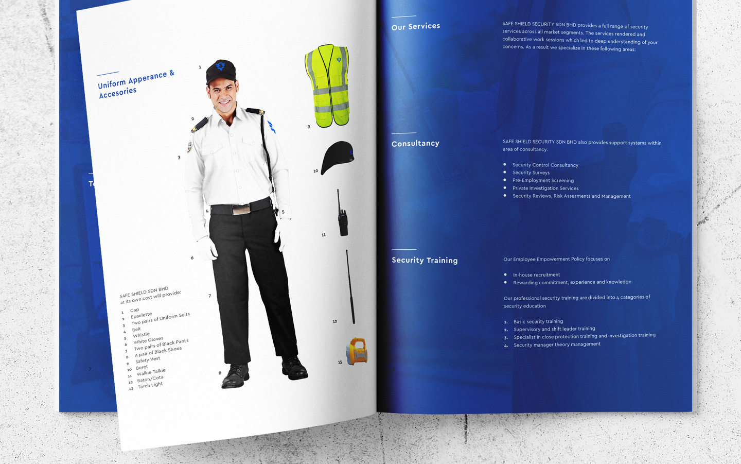
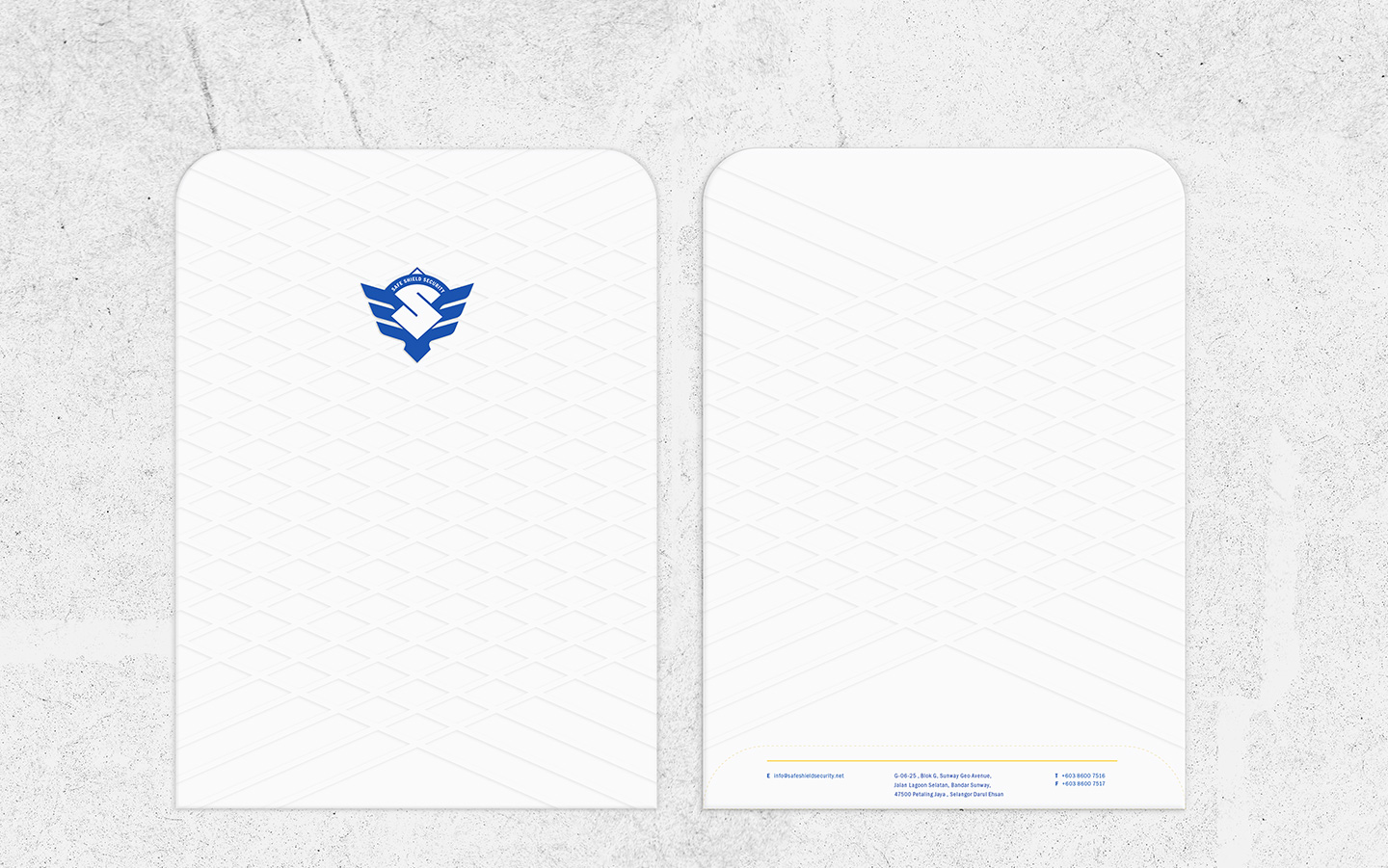
Logo Design Stationery Design Signage
Logo Explorations & Development
The company built upon trust and safety for everyone embraced rebranding. A contemporary minimal symbol was spread to reach a height never before. Equipped with chevron wings & a striking tail encapsulated the symbol entirely.